Understanding Flexbox: CSS Layout
I am a B.Tech Computer Science student in my second year, aspiring to become a software engineer with a strong interest in web development. Currently, I am exploring development while actively practicing Data Structures and Algorithms (DSA) to enhance my problem-solving skills and speed. I am passionate about contributing to open-source projects and aim to work for a product-based startup or an MNC in the future.
In this article , we will learn about the core of CSS Layouts - Flex and Grid.90% of css involves using changing display of the blocks to “ flex” display .What exactly is this?
Need
Before the introduction of flex , managing CSS layouts was problematic. Developers used to rely on absolute and relative positioning, and outdated properties like float. Relying on position-specific styles created problems with responsiveness. Moreover, there was no defined logic—it was pure trial and error on which the layouts were arranged. There was no accountability.
Parent Containers
Before moving into flex , you need to understand one important thing: these layout properties are always applied on the parent container, but they affect how the child elements inside it behave
.parent {
  display: flex;
}
In this case, .parent becomes a flex container, and all the boxes inside it (its children) will now follow the flexbox rules—like aligning in a row, wrapping, spacing, etc.
So always remember: you define it on the parent, but it controls the layout of the children.
Flex : One dimensional Layout
A flex layout lets you control a block (it could be a div, span, table, or anything else) in one direction only—either along the X-axis (row) or the Y-axis (column). This is what we mean by one-dimensional layout.
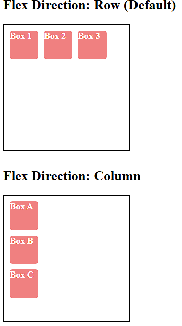
When you set display: flex on a parent container, all the child elements inside it automatically get arranged along a single axis. The direction of that axis is controlled using the flex-direction property.
By default,
flex-directionis set torow, so the items line up horizontally (left to right).You can change it to
columnif you want the items to stack vertically (top to bottom).
Sample :Code
<!DOCTYPE html>
<html lang="en">
<head>
  <meta charset="UTF-8">
  <title>Flex Direction Example</title>
  <style>
    .container {
      display: flex;
      height:200px;
      width:200px;
      border: 2px solid black;
      padding: 10px;
      margin-bottom: 30px;
      gap: 10px;
    }

    .row {
      flex-direction: row;
    }

    .column {
      flex-direction: column;
    }

    .box {
      background-color: lightcoral;
      height:50px;
      width:50px;
      color: white;
      font-weight: bold;
      border-radius: 5px;
    }
  </style>
</head>
<body>

  <h2>Flex Direction: Row (Default)</h2>
  <div class="container row">
    <div class="box">Box 1</div>
    <div class="box">Box 2</div>
    <div class="box">Box 3</div>
  </div>

  <h2>Flex Direction: Column</h2>
  <div class="container column">
    <div class="box">Box A</div>

    <div class="box">Box B</div>
    <div class="box">Box C</div>
  </div>

</body>
</html>
The first main property was flex-direction, which decides the direction of the layout (row or column).
Now let’s dive into some other important properties that help you control how the child elements behave inside a flex container.
Aligning Child Items
The example which we took here ,was just a parent div , which has 3 other div’s(3 children) and each children has a text inside . We had already learn property called text align : which align the text inside any block to either left center or right . But point to be noted here is that this is only applied on text .Now what if we wanted to move the 3 div’s itself to the center / left / right of the parent div ?Text align wont work there.
Justify- Content (Main axis)
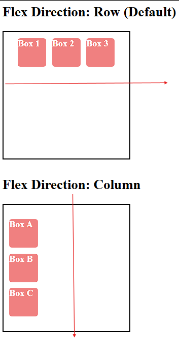
This property controls the arrangement of the children along themain axis . Now lets’s say you apply justify content , center on the container class over here .You would expect the children (all the div’s to move to the center on the main axis)
What exactly do you mean the main axis ?
If you set flex-direction: row, the main axis is horizontal
If you set flex-direction: column, the main axis is vertical
.container {
      display: flex;
      justify-content:center;
      height:200px;
      width:200px;
      border: 2px solid black;
      padding: 10px;
      margin-bottom: 30px;
      gap: 10px;
    }
Compare this image with the previous image , you would see they are arranged horizontally along their main-axes
Align-Items (Cross Axis)
This property controls the alignment of children along the cross axis. Now what do we mean by cross axis ? Well, the cross axis is always perpendicular to the main axis.
If you set
flex-direction: row, the main axis is horizontal → cross axis is verticalIf you set
flex-direction: column, the main axis is vertical → cross axis is horizontal
.container {
      display: flex;
      align-items:center;
      height:200px;
      width:200px;
      border: 2px solid black;
      padding: 10px;
      margin-bottom: 30px;
      gap: 10px;
    }
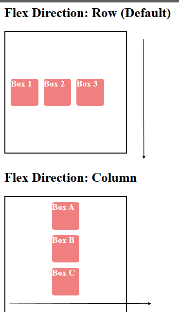
You can even combine properties , justify content and align items to control the children both horizontally and vertically .
flex-start→ Items align at the start of the axiscenter→ Items align at the center of the axisflex-end→ Items align at the end of the axisspace-between→ Equal space between itemsspace-around→ Equal space around itemsspace-evenly→ Equal space between and around items
Source Image: Google
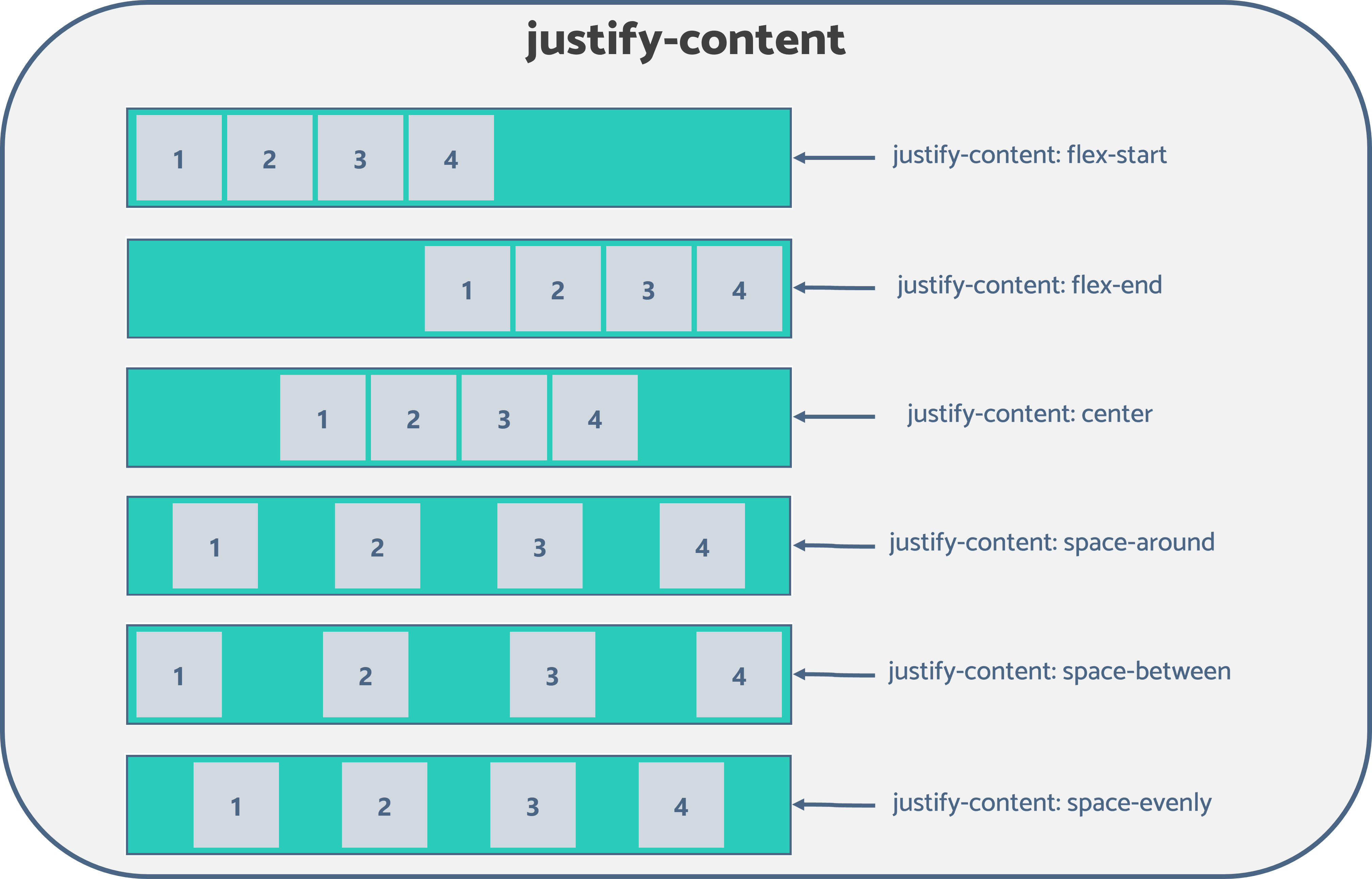
Understanding difference between space-around, space-between and space-evenly
From the above image it is clearly visible that the ,
space-between→ only spaces between items , edges don’t have space.space-around→ spaces on both sides, but edges have half spacespace-evenly→ spaces are equal everywhere, including edges
Except these properties ( space,between,space-around and space-evenly) all other properties even apply to align-items.Align-items has its own property ( call stretch and baseline)
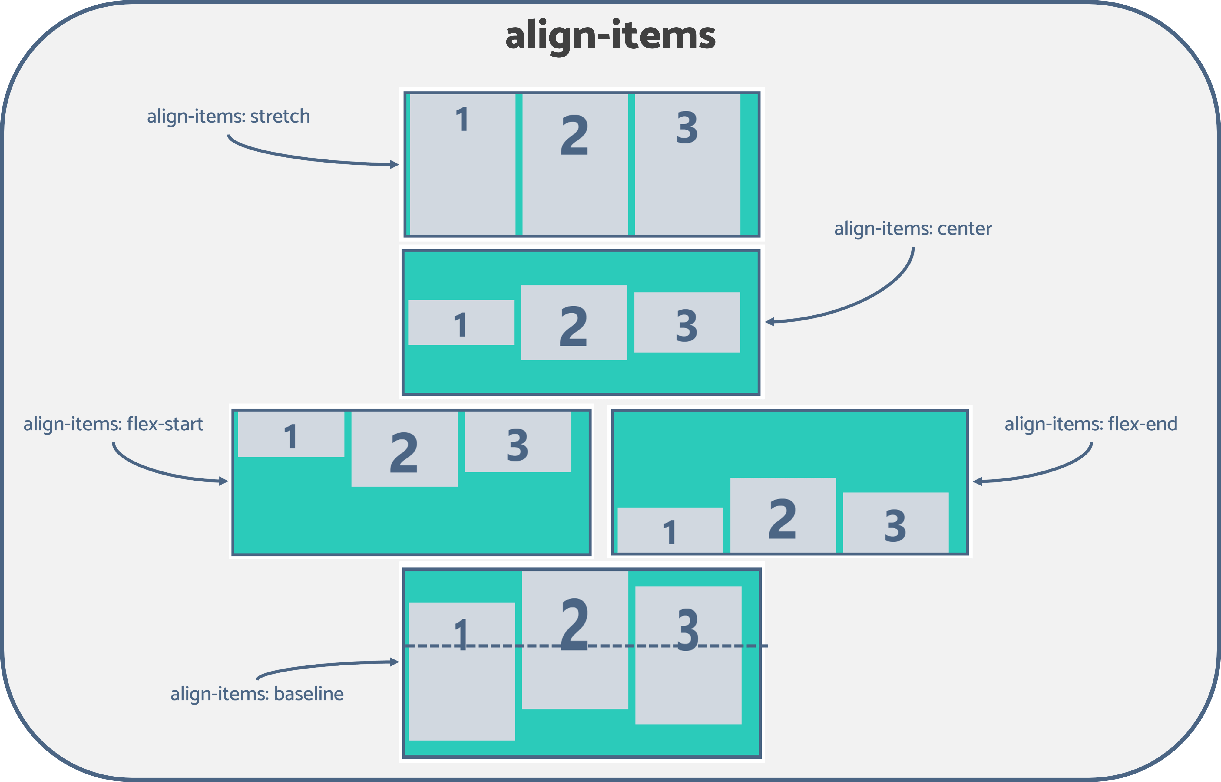
From the above image it’s obvious that the
stretch→ Stretches items to fill the full height or width of the container (default behavior).baseline→ Aligns items based on the baseline of their text content.
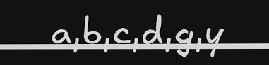
A baseline is the invisible line that text sits on — not the bottom of the box, but the line where letters like "a", "b", "c" sit. Letters like "g" or "y" go below this line.
There are the most used basic properties regarding flex .There are more properties which we will understand more in the upcoming articles